Personal Project — Product & Interaction Design
AntiScroll
The day's new research papers in one column. Built to replace the doomscroll rather than fight it.
The Idea
I built AntiScroll for myself — the thing I open instead of social media. It pulls the day's new preprints from arXiv and bioRxiv into one column. No likes, no algorithm, no recommendation engine. Just what actually went up today in the fields I care about.
It sits in the same place in my day that doomscrolling used to, but the point is that you come away having read something.
Setup, Once
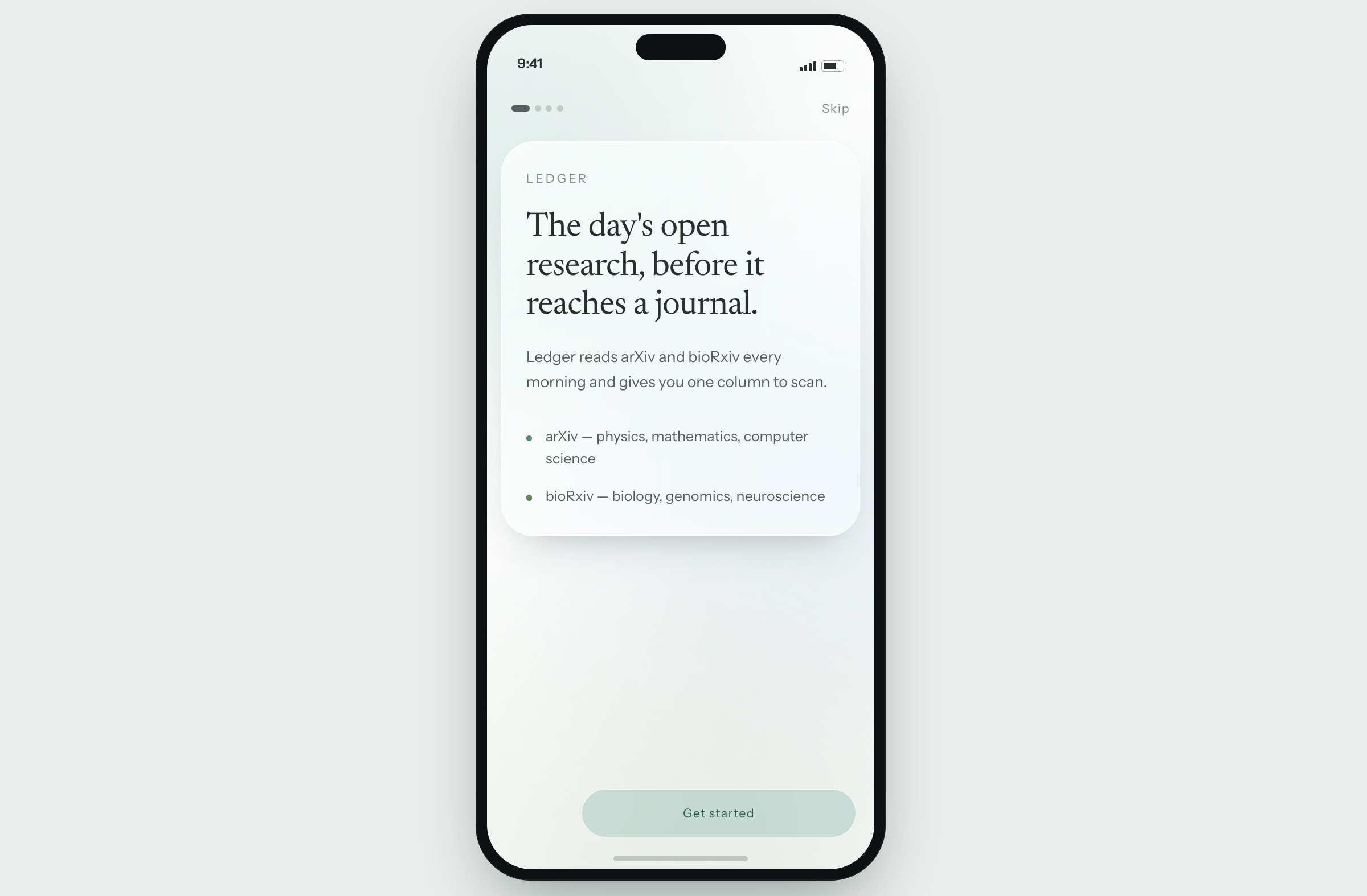
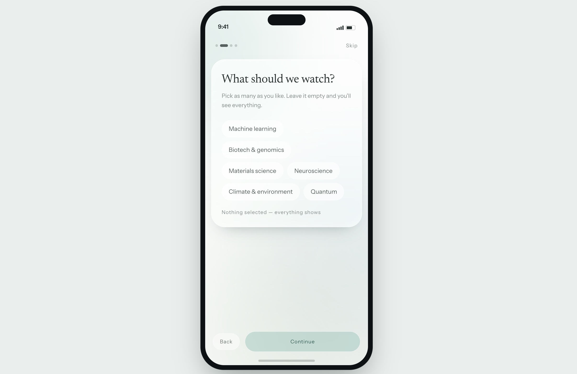
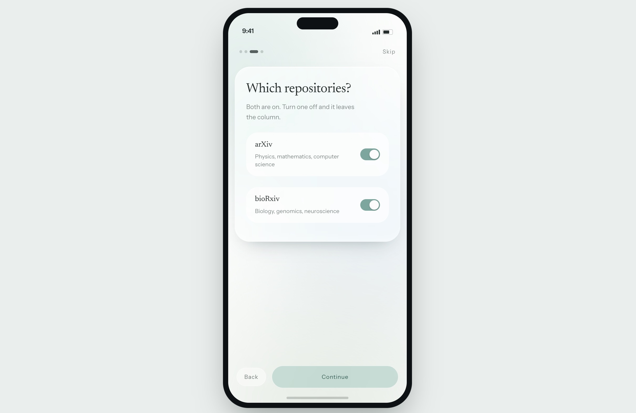
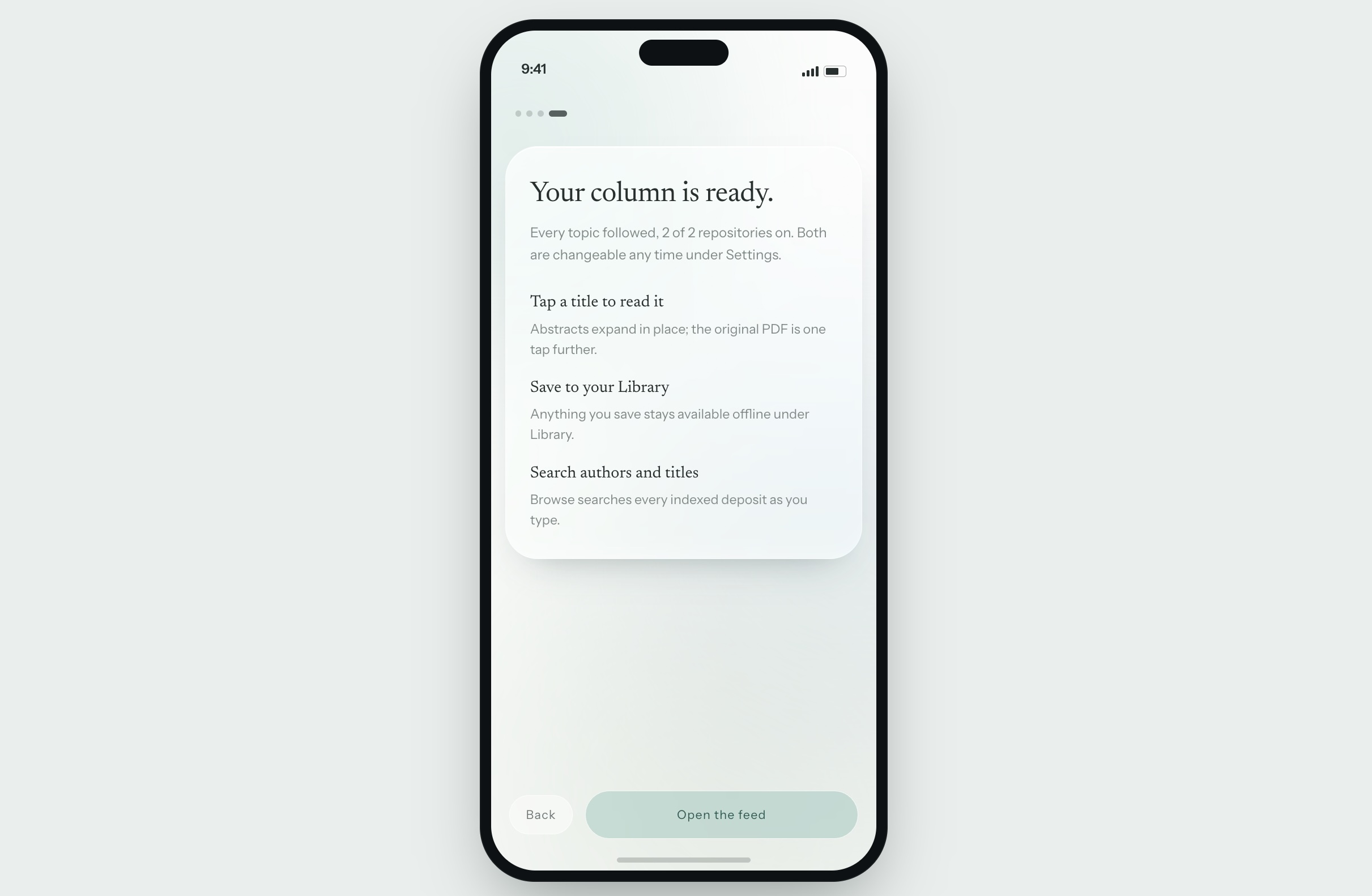
Onboarding is four short screens, and then it stays out of the way. You pick your topics, or pick none and see everything, and turn arXiv and bioRxiv on or off. After that you are dropped into a feed that is ready to read. Every choice remains editable in Settings, so nothing here is a one-way door.
The Glow
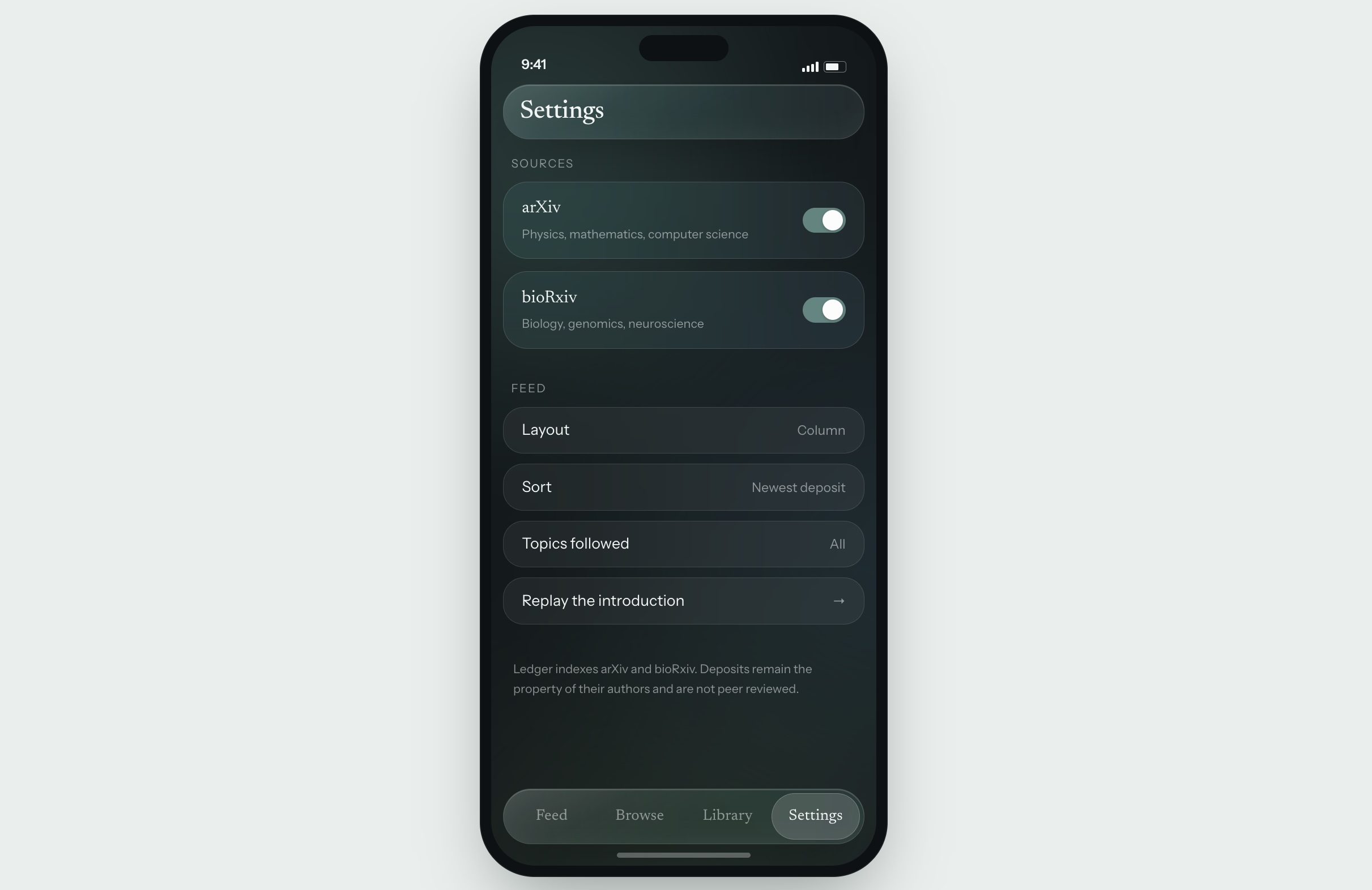
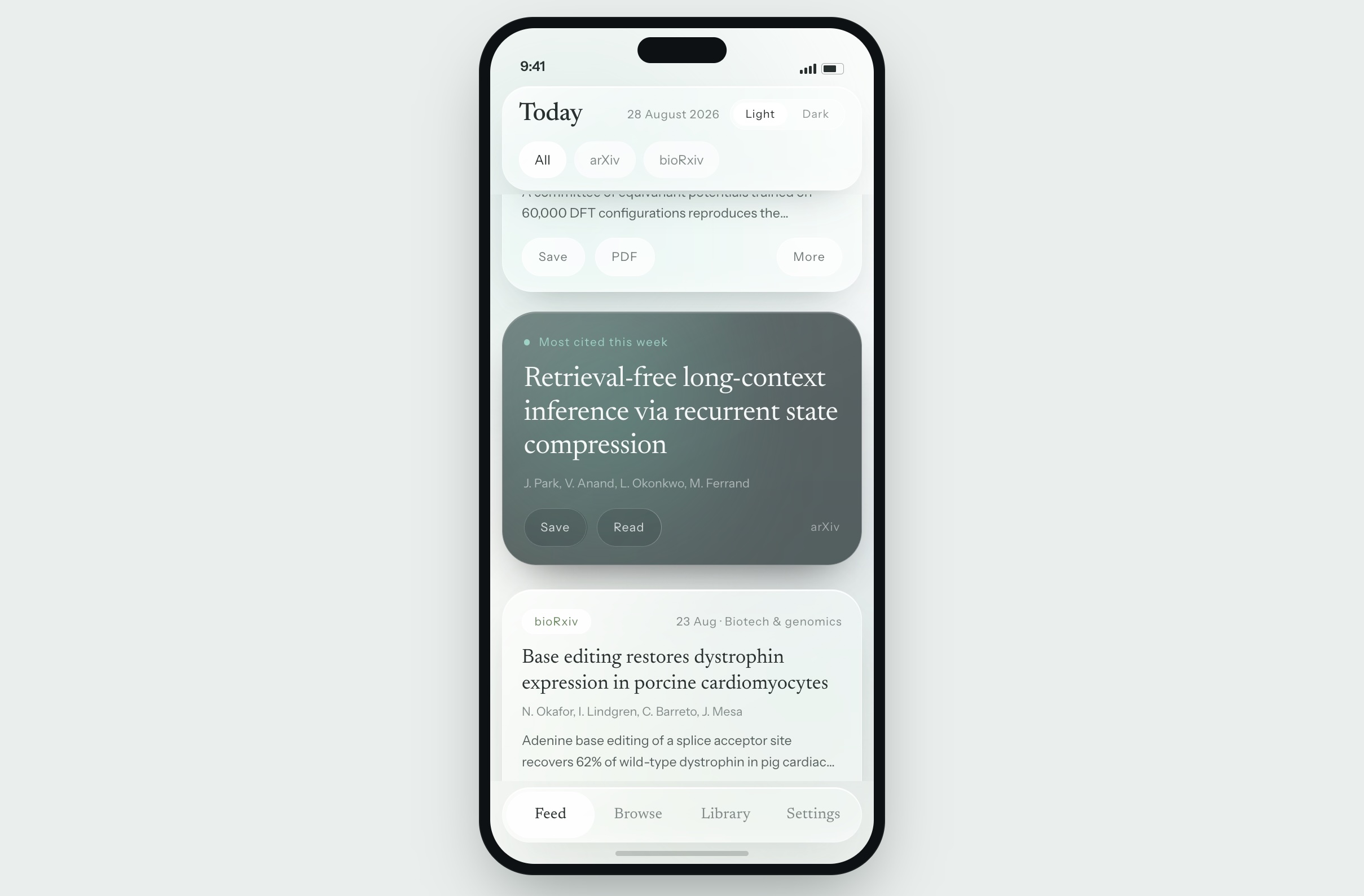
There is one deliberate piece of stimulation in the app: a soft green-blue glow that builds as you scroll further into the feed. It stands in for the color and motion a social app would use to keep you moving. I wanted it to read as attention, not alarm, so it stays in cool low-saturation greens and blues rather than the reds and oranges most feeds reach for. Ambient rather than urgent — alive enough that the feed doesn't feel dead, calm enough that thirty seconds in it doesn't feel like thirty minutes in.
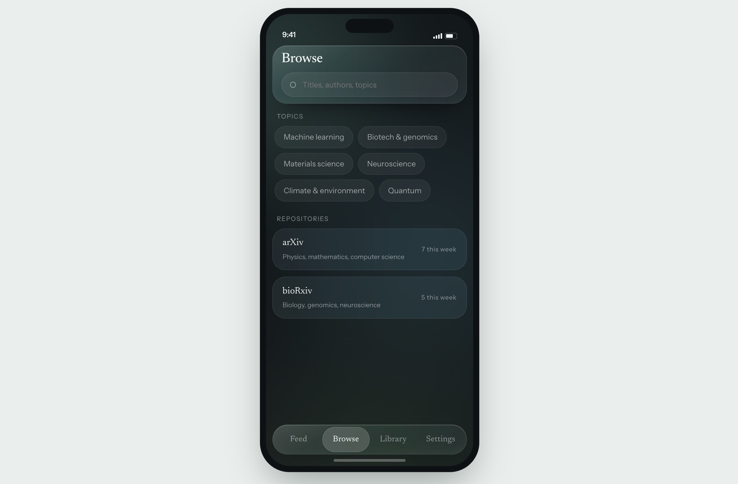
It is most visible in dark mode, where the glow pools around whatever card has your attention, closer to a reading lamp than a notification.
Reading, Saving, Searching
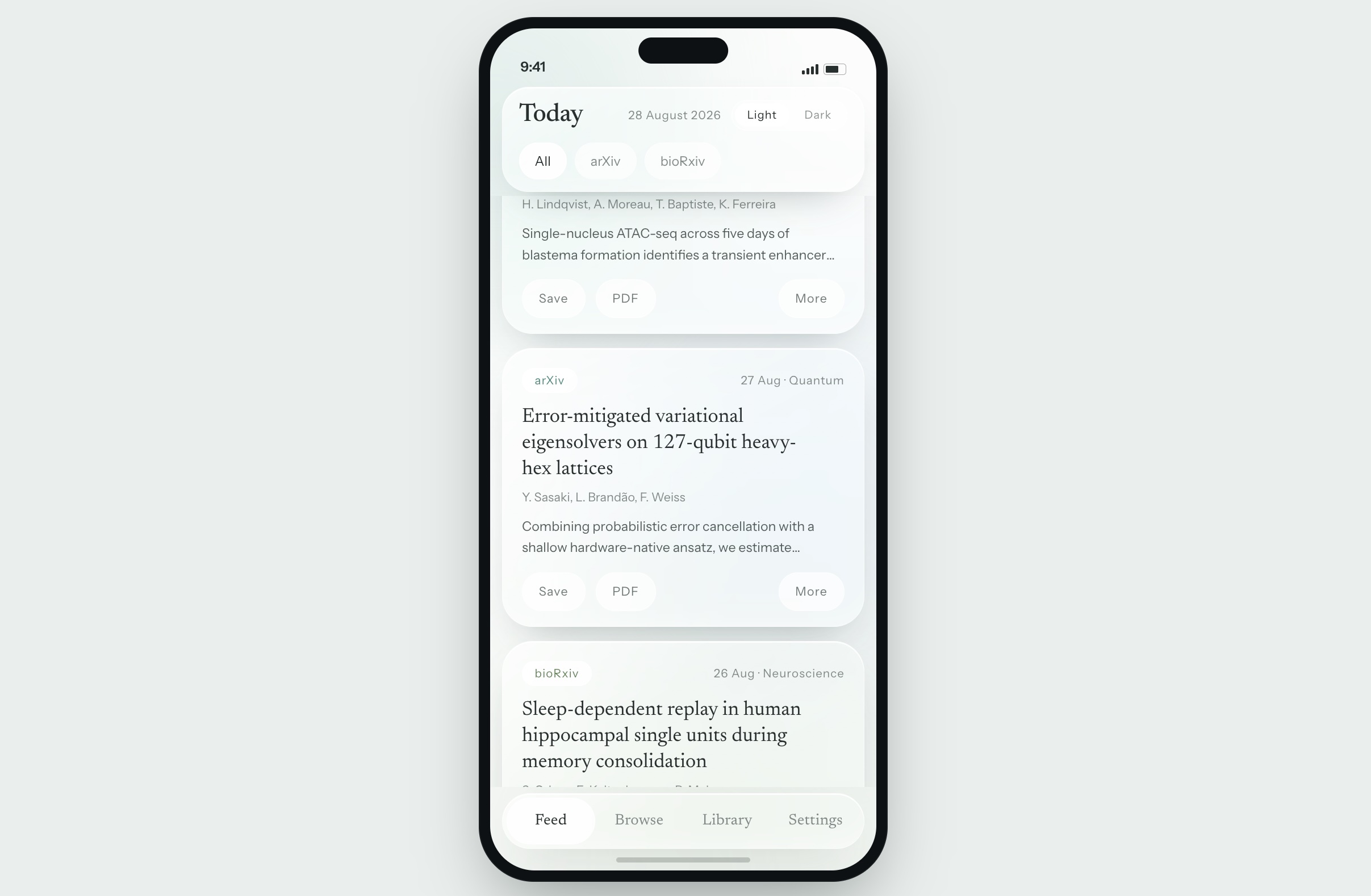
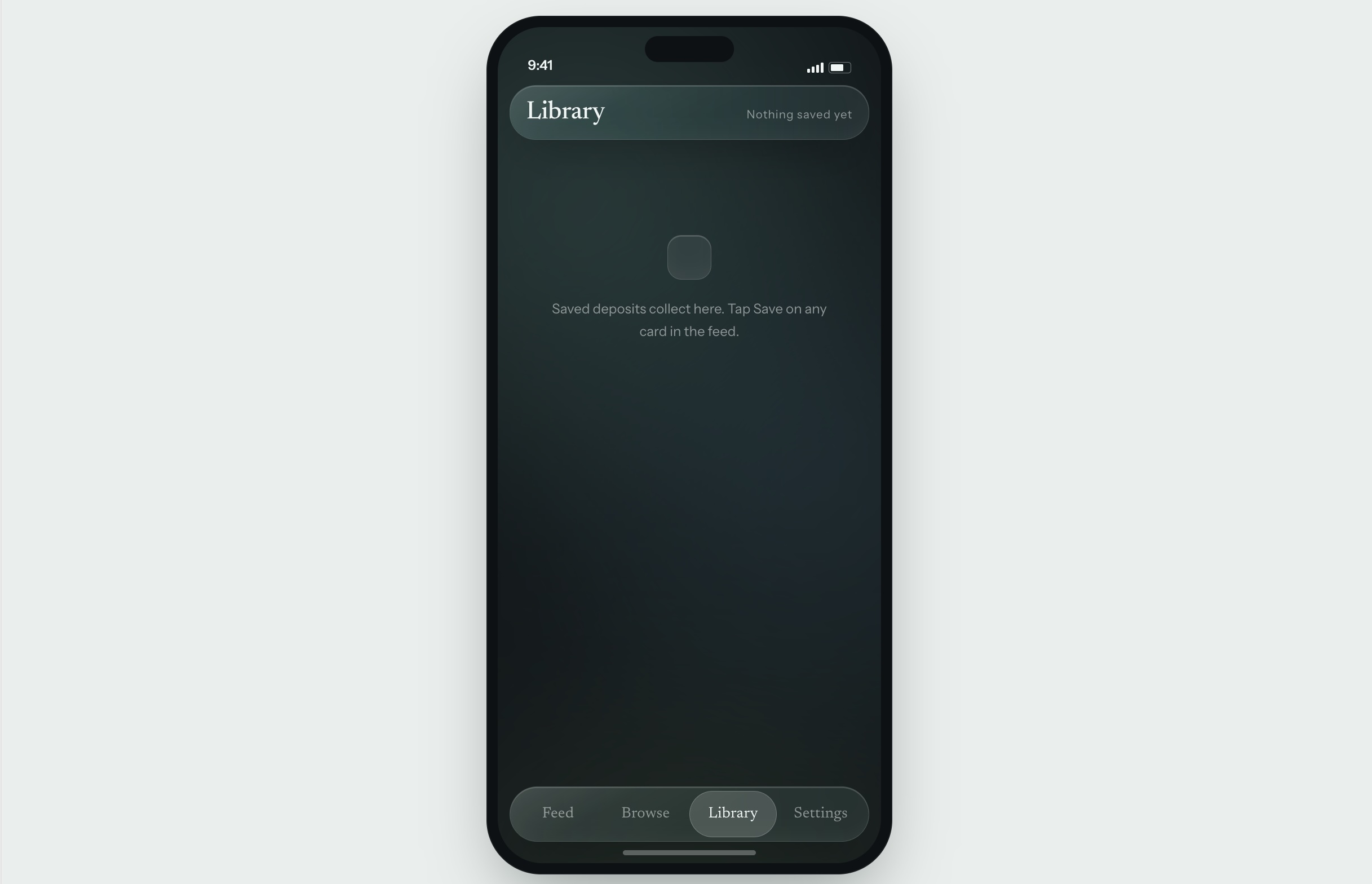
Tapping a title expands the abstract in place, and the PDF is one tap further for anything worth the full read. Saved items go to a Library that stays available offline. Browse turns the same topics and repositories into a searchable index rather than a feed, for the days when you already know what you are looking for.
Specs
arXiv, bioRxiv
Single column
Newest deposit
Light / Dark