Case Study — Object & Information Design
Date Clock
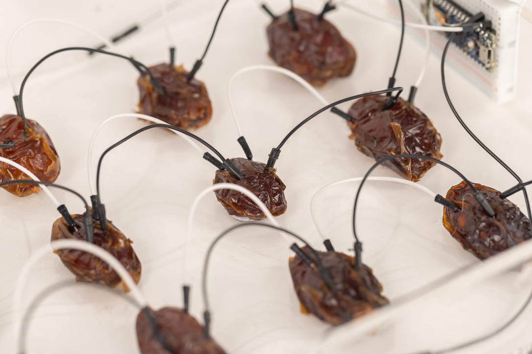
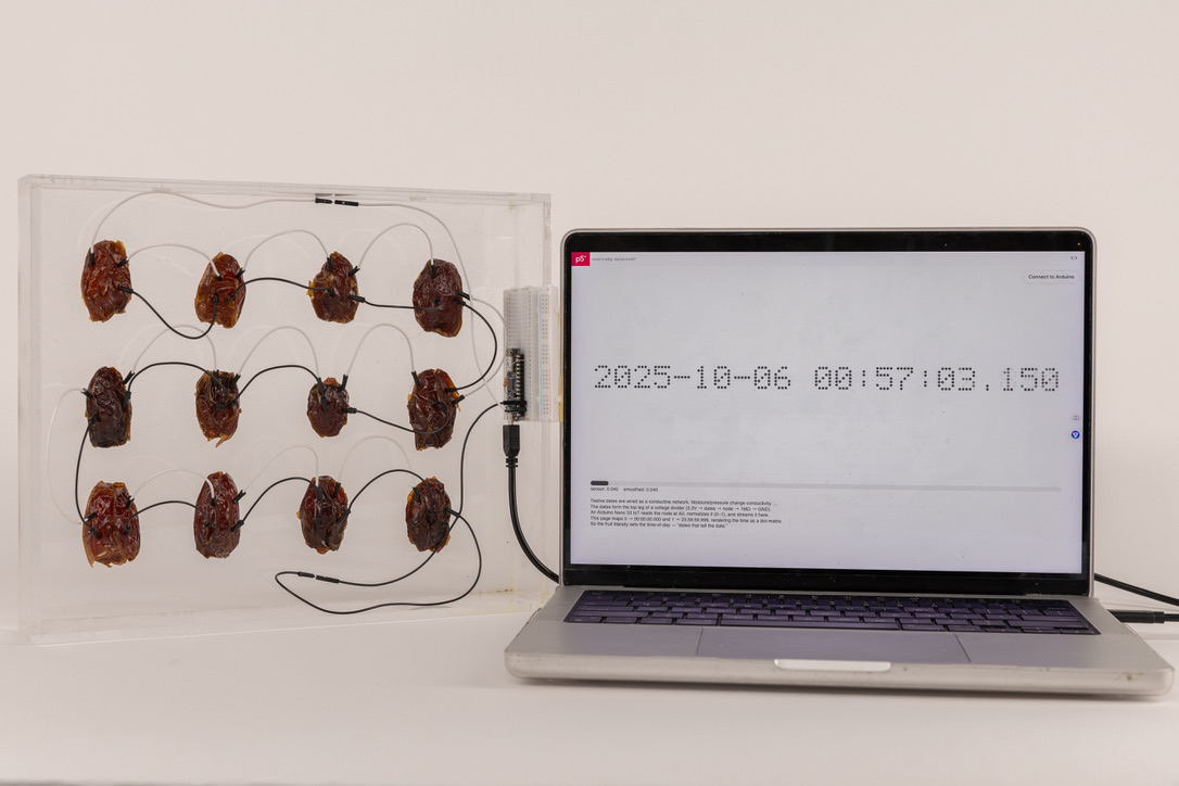
A clock made of dates. As the fruit dries out, its conductivity changes, and that changes the value on the clock.
The Problem
Digital clocks give more precision than most decisions need. You get a countdown to the second for something that only matters by the day or the week. I wanted to make a timepiece that was openly imprecise, and find out whether people would still trust it, or even prefer it.
The Approach
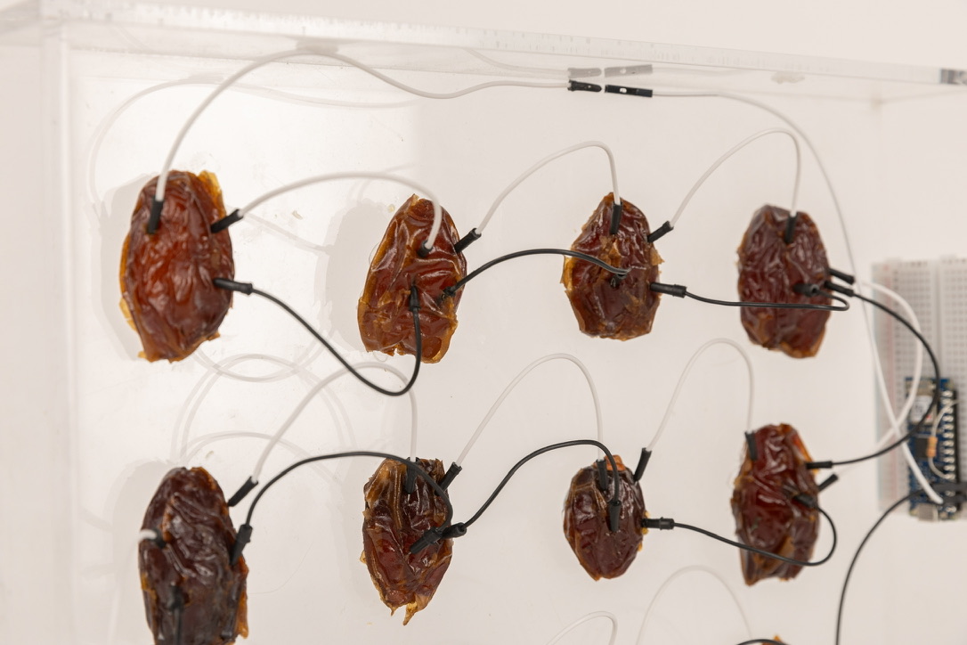
I attached twelve dates to an acrylic box in a 3 x 4 grid with hot glue, and wired them in serial to an Arduino Nano IoT 33 on a breadboard. The dates act as one half of a voltage divider, with a 1M ohm resistor as the other half. The positive side runs to the 3.3v pin and the negative side runs through the resistor on A0/D14 to ground. The Arduino reads the node voltage and normalizes it between 0 and 1, where 0 is 0v and 1 is 3.3v. In p5.js that value is smoothed and mapped to a time of day, multiplied against the 86,400,000 milliseconds in a day. As the dates lose salt, minerals, and water, their conductivity changes, and the node voltage changes with it. There is nothing to read at a glance. The state of the object is the interface, so you build a sense of it over time rather than parsing a number.
It is not a precise way of keeping time. The node voltage does not change linearly, and while a fresher date is generally more conductive than an older one, the relationship is loose enough that it responds to the dates more than it reports the hour. I may refine it if I find a way to make it track the passage of time more reliably. In the meantime I think it works as a way to observe the relationship between time and rotting fruit.
What I Learned
People learned to read it faster than I expected. After a day or two, testers had their own rough sense of early, midway, and spent, without my having labelled anything. It changed how I think about legibility. Precision and usability are not the same thing, and a rougher signal that you have to get familiar with can produce a stronger relationship with an object than a screen does.