Personal Project — Product & Interaction Design
Nemesis
An app for finding a nemesis, on the premise that having an enemy is fun and everyone deserves someone to plot against them.
The Idea
Nemesis is an app for finding a nemesis. You answer a set of questions about what irritates you, it returns people well suited to irritating you, and you declare a feud against one of them. The premise is that having an enemy is fun. A rivalry gives you something to occupy yourself with, and it is a more entertaining thing to maintain than most of what a dating app produces. So the matching runs on friction rather than compatibility — who sets you off, rather than who you get along with.
It is a joke, but it only works if the interface plays it straight. So it has the full apparatus of a dating app — onboarding, a matching algorithm, a relationship dashboard — pointed at rivalry instead of romance.
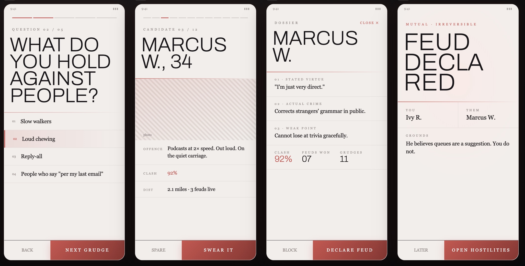
Setup
Onboarding borrows the structure of a dating app and swaps out the target: a grudge questionnaire instead of an interest quiz, candidate dossiers instead of profiles, a match score ("Clash: 92%") instead of a compatibility score. Each dossier lists a stated virtue, an actual crime, and a weak point, before you spare the candidate or swear a feud against them — "Declare Feud" carries the same weight a normal app gives "It's a Match."
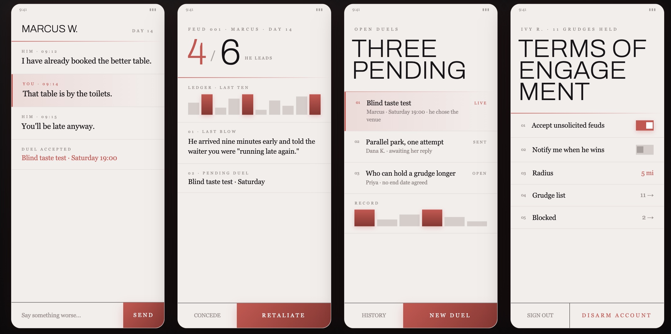
Living the Feud
Once a feud is declared, the app tracks it the way a relationship app tracks a relationship: a running ledger of who landed the last blow, a message thread for trading insults, open duels with real stakes (a blind taste test, a parallel-parking contest), and a settings page — "Terms of Engagement" — governing how unhinged you're willing to let it get, down to a toggle for whether unsolicited feuds can find you at all.
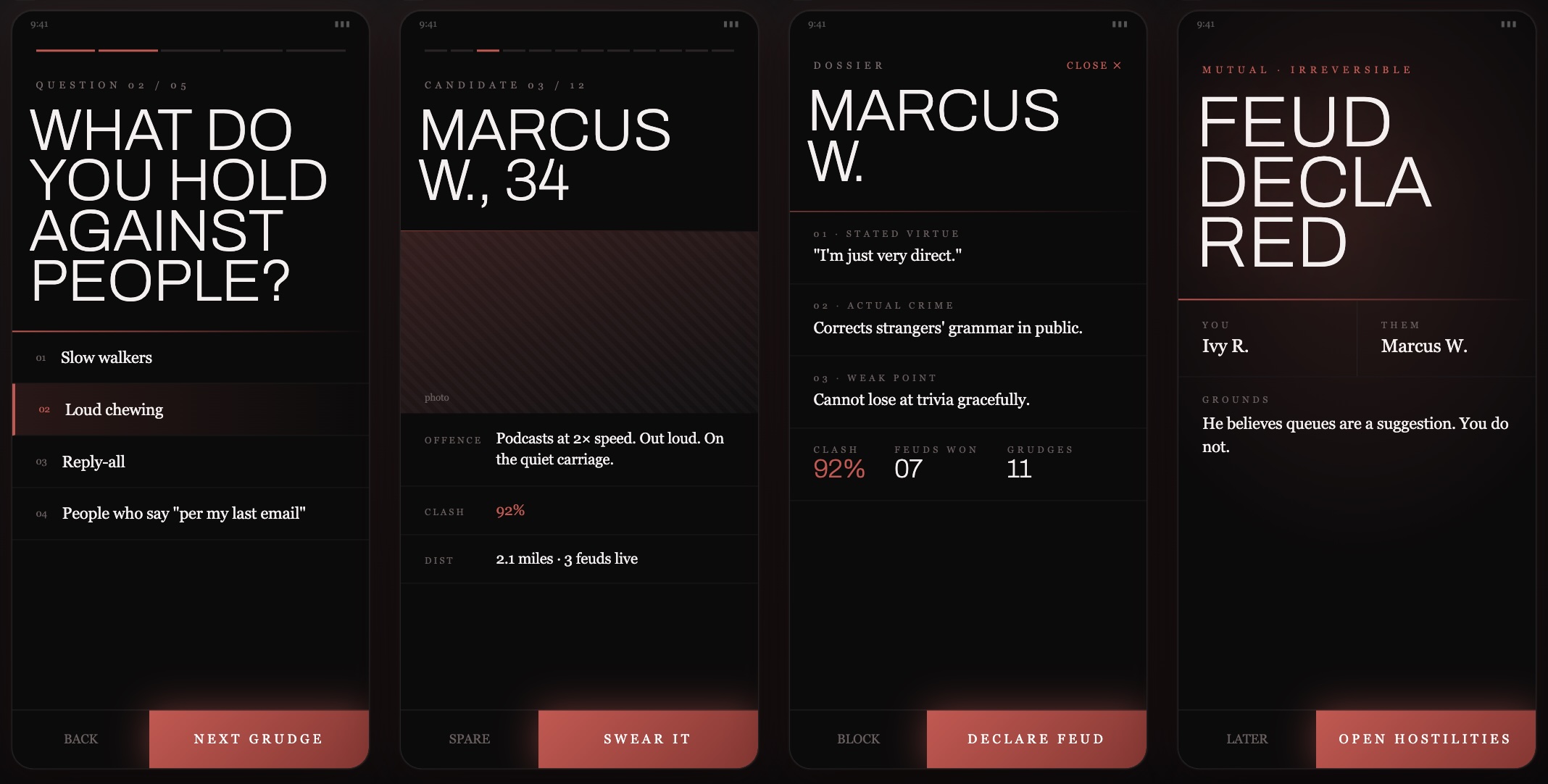
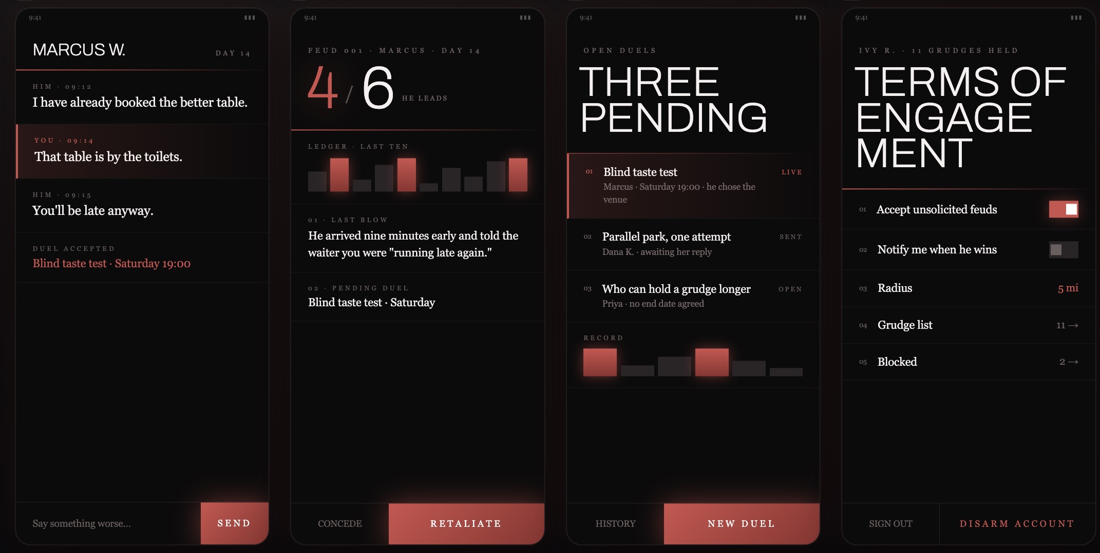
Light & Dark
Both themes stay in the same restrained, editorial register — serif headlines, quiet gray text, a single red accent doing all the emotional work. Dark mode just turns the temperature up: the same red reads more like a warning light than a highlight, which felt right for an app that's fundamentally about holding a grudge on purpose.